This is the point where I came to a monumental brick wall in the development of my website, with a problem, which could only be solved by starting the website pretty much from scratch. The problem is that the way my website was coded in Flash, all of my content images were loaded into the file at once, but their transparancy changed depending on which project was selected. Because the website moved around from one page to another, Flash had to move every single image at once. Because there was a function to operate the movement of each item at every frame. And the website was set at 32 fps, it meant that there are a huge amount of calculations running per second, which mean that every new bit of content I added caused the entire thing to slow down.
Because my website is effectively broken, I would have to spend hours going back over the code and changing everything. This drew attention to a very important point, which I think in the long run I will actually benefit from: Flash is NOT the best program to create this website. I spent hour upon hour coding the website, copying and pasting and editing code, thinking that if one piece of code worked then I could use that an andless amount of times. Although logically this is correct, I never took into account that Flash may not be fast enough to run the .swf, meaning that the very foundation of the website and every bit of code I had put in from the moment I started working on the website in Flash was doomed to fail.
In an ideal world I would've had the time to pick up and learn some new skills in html, css and javascript and would never have need to use flash to code my site. My thinking was that the amount of time it would take me to simply learn the skills necessary to code my website before even been able to start it, I could've finished my site in Flash and get it looking and functioning correctly as a proof of concept to show how my idea was. Looking back, it may have just been easier to learn just enough of the technical skills to be able to put something together, which is smoother, less code heavy and complete, but on the other hand I may not have had enough time. I think my next step will be to learn how to use jquery over summer and code my website in my own time. I think the fact that the workload for a 10 credit module is 100 hours, learning 3 entirely new coding languages was just not feasable and although in the end I came to an irreversable problem, with which I couldn't have predicted, I still feel that my final example shows the way the website navigates and the graphical style of my brand identity and can definitely give the user an idea of what the website would be like, were I able to fill in the blanks without completely breaking my website.
Here are 2 versions of my website. I have uploaded them as zip files, which contain a html file and a swf file. I would recommend opening the html files so it can be seen in its intended context.
Here is an earlier version that works at the correct speed
Here is the later and sadly, final version, which unfortunately could simply not progress any further.
Thursday, 6 May 2010

Second Design

I went back and used some of the textures from the paper I scanned in and put them into my website. I much prefer this look as it looks a bit softer than the previous design.
Saturday, 1 May 2010
First Design

This is my first design for the actual aesthetic look of the website. I wanted to go with something vibrant and colourful, which would reflect the style of my game, which I wanted to use as my main piece. It was originally meant to look almost like a comic book but then I steered towards making it look like an old poster from the early 1900s. Perhaps a circus poster.
Friday, 30 April 2010
Arrows
In this wireframe I have put in the arrows and made them move the content as a scroll box and a couple of arrows to navigate through content. It looks rough but its just to show how navigation will work. You can only select the top 2 projects and I have only put 3 images in just to make sure the code works.
Wednesday, 31 March 2010
Animated Devil
In my next wireframe I have added the animated paper devil from my previous post. I also made the image of my face look like a stamp, however I really don't like the look of it as it makes it look like a highschool french textbook.
Interactive Head
in my next wireframe I have made a bit of code, which goes to a different frame of a movieclip depending on the mouse cursors position, in relation the clip itself. I then filmed myself looking around in various different directions, then used the best keyframes to make up a movieclip. Each frame of the movieclip is looking in a different direction so that it creates an effect, which makes it look like my head is following the mouse cursor around the screen.
Tuesday, 30 March 2010
First Wireframe
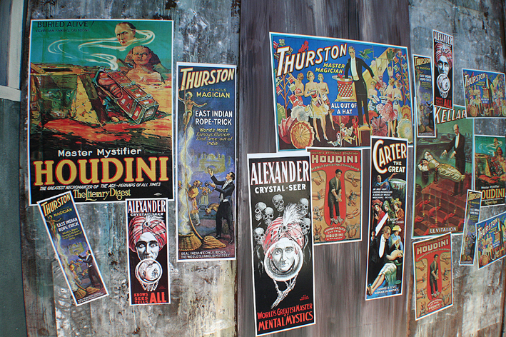
Here is my first wireframe. It basically shows how I want the site to navigate from one section to another. I wanted to have the site look like a wall of posters, with each poster representing a different section. The viewpoint of the person viewing the website would be like a camera panning around the "wall".
Here is just a picture of a wall of posters to give an idea of the kind of thing I wanted.

Here is just a picture of a wall of posters to give an idea of the kind of thing I wanted.
Sunday, 28 March 2010
Paper Concept
Here is another concept for my website. I printed in a load of different coloured paper and brown paper to use as textures for my website. I then took the illustrator files from my game project and layed them over a layer with a ripped piece of paper. I like the idea of using real materials although this reminded me a bit of the opening sequence from Home Improvement.
1st Website Idea

This is a website concept based on the look of my CV. Although I think that look worked well in print it was a little bit plain as a website. I really wanted to come up with a dynamic website, which would be interactive, animated and unique. The reason for this is because being on an Interactive Media Design, I want something, which will be interactive.
Inspiration
I looked at quite a lot of different websites in my research, that I found featured on thedesigninspiration.com
There were a lot of "web 2.0" looking websites, all with a similar graphical styles and fonts. Although a lot of the websites looked professional, they weren't always memorable. The 3 websites I did really like each had something different, individual and personal to the designer.

Max Shaman - The thing I found really interesting in this website was the playful navigation, obviously playing on the designer's surname as a stimulus for the entire website, going with the theme of voodoo and tribes. It takes a few seconds to work out how to use it so some may argue that it is a usability issue, however I think thats the fun of the website. It makes you want to play with it and see what happens when you stick a needle in the voodoo doll's eyes!!

Diego D'Sousa - I really liked the scrapbook style of Diego's website as this kind of style is something I think I would like to do with my own portfolio. I also love the way that when you navigate to another section it moves around in an almost 3 dimensional way. The only couple of things that I didn't like about the website were the fact that it starts playing music without you wanting it to. There is an option to pause it but it took a minute to work out, which was a bit annoying. Also I thought that navigation was confusuing at times and often felt myself going from A to B via C and D.

Daniel Gutiérrez - This was probably my favourite website. The fact that Daniel uses a recurrent character throughout the website as well as using a "paper" look to the style, I felt this kind of aesthetic was most similar to the kind of thing I wanted to achieve. The navigation was straight forward, the colours and images were crisp and visually pleasing and interesting without being elaborate or in your face.
There were a lot of "web 2.0" looking websites, all with a similar graphical styles and fonts. Although a lot of the websites looked professional, they weren't always memorable. The 3 websites I did really like each had something different, individual and personal to the designer.

Max Shaman - The thing I found really interesting in this website was the playful navigation, obviously playing on the designer's surname as a stimulus for the entire website, going with the theme of voodoo and tribes. It takes a few seconds to work out how to use it so some may argue that it is a usability issue, however I think thats the fun of the website. It makes you want to play with it and see what happens when you stick a needle in the voodoo doll's eyes!!

Diego D'Sousa - I really liked the scrapbook style of Diego's website as this kind of style is something I think I would like to do with my own portfolio. I also love the way that when you navigate to another section it moves around in an almost 3 dimensional way. The only couple of things that I didn't like about the website were the fact that it starts playing music without you wanting it to. There is an option to pause it but it took a minute to work out, which was a bit annoying. Also I thought that navigation was confusuing at times and often felt myself going from A to B via C and D.

Daniel Gutiérrez - This was probably my favourite website. The fact that Daniel uses a recurrent character throughout the website as well as using a "paper" look to the style, I felt this kind of aesthetic was most similar to the kind of thing I wanted to achieve. The navigation was straight forward, the colours and images were crisp and visually pleasing and interesting without being elaborate or in your face.
Saturday, 20 March 2010
Animated logo concept
I have spent a long time adapting one of my logos so that it is animated when you roll over it. It was a concemptual idea, which I was considering following throughout my whole website. The style of it was meant to look a bit crazy and almost pshychedellic, however I was put off this idea when it was described as looking like something from a "hair salon website".
Wednesday, 17 March 2010
Playing Around with "Identities"

CV Design 1
This is my first design and although I liked the fonts and layout it just looked too professional and I eventually decided to scrap the design.
 CV Design 2
 CV Design 2
This is my second attempt, which I much prefer. I kept the layout and logo and added a 3D version of the logo in the background. The colours are much more eye catching in this one I think.
 Logo Designs
I played around with different logos and colour schemes but still can't decide on any one in particular. I like the text style of the top ones as I think having the dot of the "i" in design in the middle of the "o" in Owen brings the two together quite nicely. I also really like the colours of the 3 with the black background, however I'm not sure I want a plain black background in my design. Logo Designs
Subscribe to:
Posts (Atom)