Friday, 30 April 2010
Arrows
In this wireframe I have put in the arrows and made them move the content as a scroll box and a couple of arrows to navigate through content. It looks rough but its just to show how navigation will work. You can only select the top 2 projects and I have only put 3 images in just to make sure the code works.

Wednesday, 31 March 2010
Animated Devil
In my next wireframe I have added the animated paper devil from my previous post. I also made the image of my face look like a stamp, however I really don't like the look of it as it makes it look like a highschool french textbook.
Interactive Head
in my next wireframe I have made a bit of code, which goes to a different frame of a movieclip depending on the mouse cursors position, in relation the clip itself. I then filmed myself looking around in various different directions, then used the best keyframes to make up a movieclip. Each frame of the movieclip is looking in a different direction so that it creates an effect, which makes it look like my head is following the mouse cursor around the screen.
Tuesday, 30 March 2010
First Wireframe
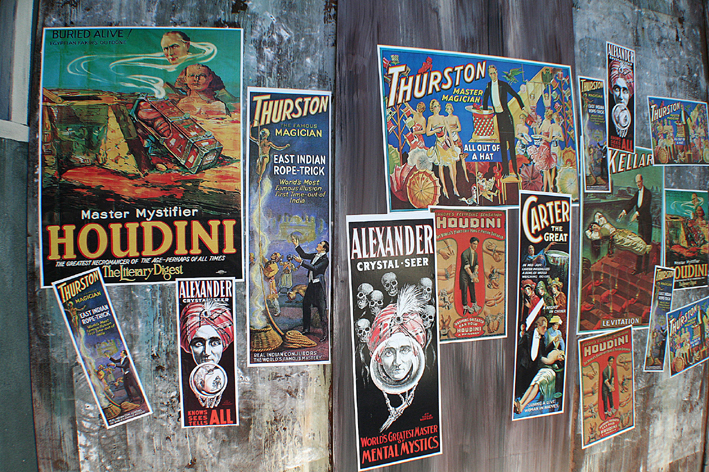
Here is my first wireframe. It basically shows how I want the site to navigate from one section to another. I wanted to have the site look like a wall of posters, with each poster representing a different section. The viewpoint of the person viewing the website would be like a camera panning around the "wall".
Here is just a picture of a wall of posters to give an idea of the kind of thing I wanted.

Here is just a picture of a wall of posters to give an idea of the kind of thing I wanted.
Sunday, 28 March 2010
Paper Concept
Here is another concept for my website. I printed in a load of different coloured paper and brown paper to use as textures for my website. I then took the illustrator files from my game project and layed them over a layer with a ripped piece of paper. I like the idea of using real materials although this reminded me a bit of the opening sequence from Home Improvement.
1st Website Idea

This is a website concept based on the look of my CV. Although I think that look worked well in print it was a little bit plain as a website. I really wanted to come up with a dynamic website, which would be interactive, animated and unique. The reason for this is because being on an Interactive Media Design, I want something, which will be interactive.
Inspiration
I looked at quite a lot of different websites in my research, that I found featured on thedesigninspiration.com
There were a lot of "web 2.0" looking websites, all with a similar graphical styles and fonts. Although a lot of the websites looked professional, they weren't always memorable. The 3 websites I did really like each had something different, individual and personal to the designer.

Max Shaman - The thing I found really interesting in this website was the playful navigation, obviously playing on the designer's surname as a stimulus for the entire website, going with the theme of voodoo and tribes. It takes a few seconds to work out how to use it so some may argue that it is a usability issue, however I think thats the fun of the website. It makes you want to play with it and see what happens when you stick a needle in the voodoo doll's eyes!!

Diego D'Sousa - I really liked the scrapbook style of Diego's website as this kind of style is something I think I would like to do with my own portfolio. I also love the way that when you navigate to another section it moves around in an almost 3 dimensional way. The only couple of things that I didn't like about the website were the fact that it starts playing music without you wanting it to. There is an option to pause it but it took a minute to work out, which was a bit annoying. Also I thought that navigation was confusuing at times and often felt myself going from A to B via C and D.

Daniel Gutiérrez - This was probably my favourite website. The fact that Daniel uses a recurrent character throughout the website as well as using a "paper" look to the style, I felt this kind of aesthetic was most similar to the kind of thing I wanted to achieve. The navigation was straight forward, the colours and images were crisp and visually pleasing and interesting without being elaborate or in your face.
There were a lot of "web 2.0" looking websites, all with a similar graphical styles and fonts. Although a lot of the websites looked professional, they weren't always memorable. The 3 websites I did really like each had something different, individual and personal to the designer.

Max Shaman - The thing I found really interesting in this website was the playful navigation, obviously playing on the designer's surname as a stimulus for the entire website, going with the theme of voodoo and tribes. It takes a few seconds to work out how to use it so some may argue that it is a usability issue, however I think thats the fun of the website. It makes you want to play with it and see what happens when you stick a needle in the voodoo doll's eyes!!

Diego D'Sousa - I really liked the scrapbook style of Diego's website as this kind of style is something I think I would like to do with my own portfolio. I also love the way that when you navigate to another section it moves around in an almost 3 dimensional way. The only couple of things that I didn't like about the website were the fact that it starts playing music without you wanting it to. There is an option to pause it but it took a minute to work out, which was a bit annoying. Also I thought that navigation was confusuing at times and often felt myself going from A to B via C and D.

Daniel Gutiérrez - This was probably my favourite website. The fact that Daniel uses a recurrent character throughout the website as well as using a "paper" look to the style, I felt this kind of aesthetic was most similar to the kind of thing I wanted to achieve. The navigation was straight forward, the colours and images were crisp and visually pleasing and interesting without being elaborate or in your face.
Subscribe to:
Posts (Atom)